Here graphs based on the V5.1 dataset created by NOAA/NCEI.
Regular updates. Check date in graph.
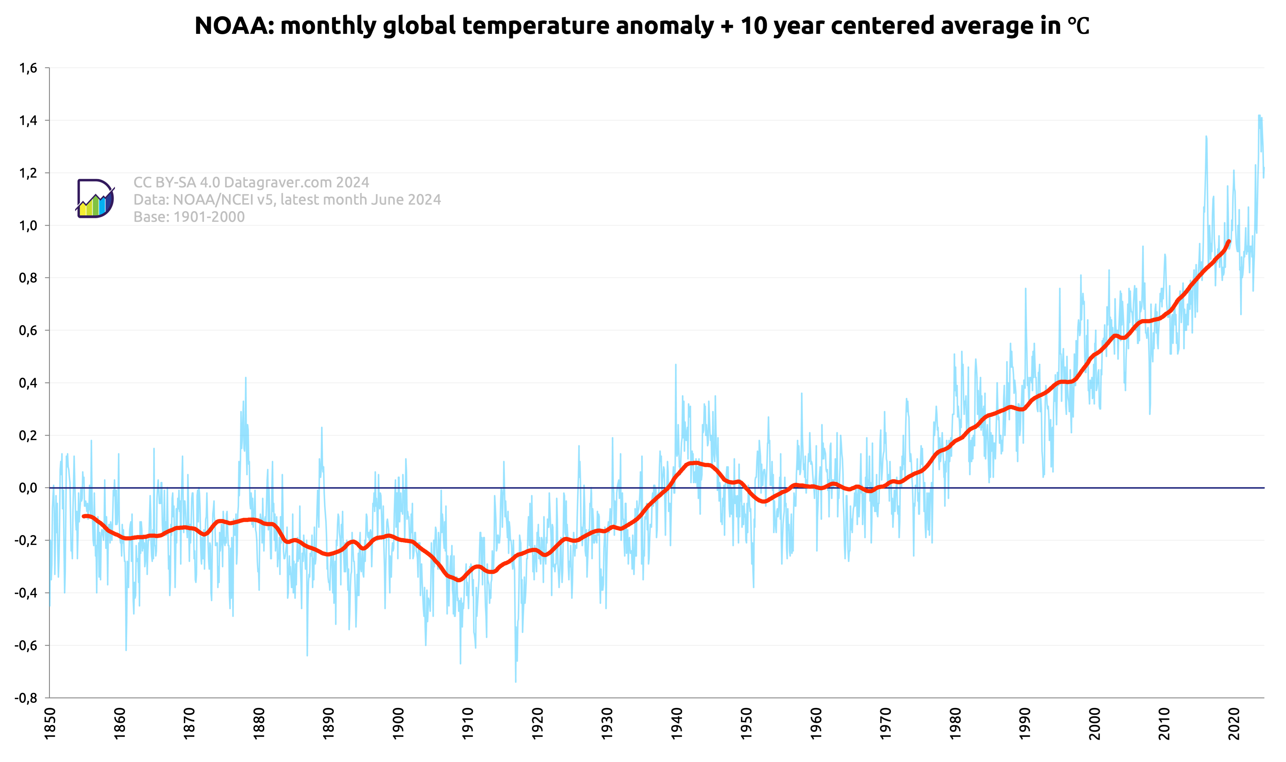
First graph is on the monthly anomalies plus a centered 10 year average.
![Graph with monthly world temperature anomalies as reported by NOAA/NCEI since 1850 compared to the 1901-2000 average, since 1880, plus a 10 year centered average.
This has gone from -0.3 around 1900 to +0.94 now.](https://datagraver.com/wp-content/uploads/2024/07/noaa_maand_20240712-1024x607.png)
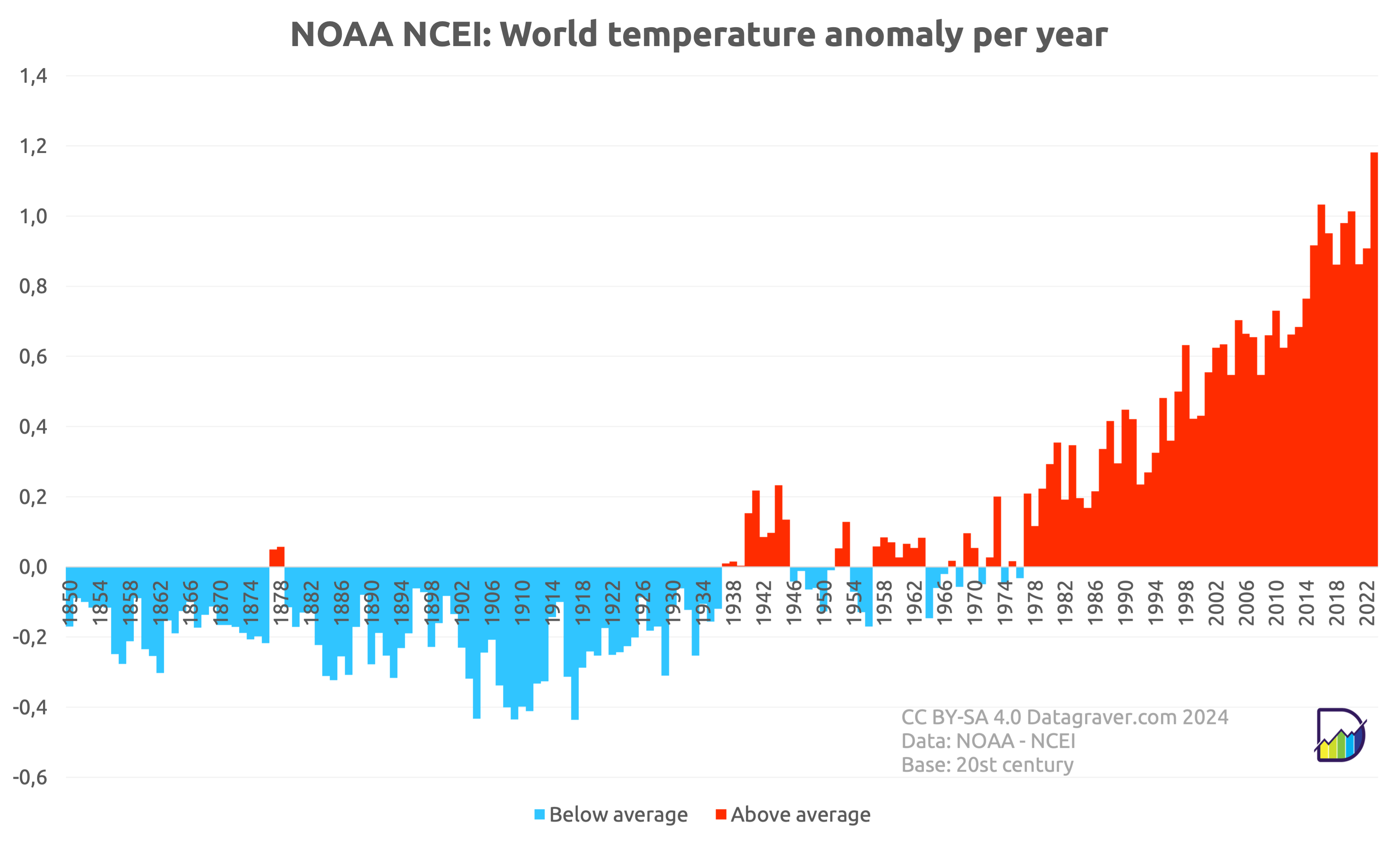
Then the yearly averages on the monthly anomalies.
![Graph with yearly world temperature anomalies since 1850 compared to the 20th century average. Steady rise since end of the seventies when it came above zero. Last 7 years it's around +0.9. 2023 at 1.2.](https://datagraver.com/wp-content/uploads/2024/01/noaa_jaar_20240112-1024x617.png)
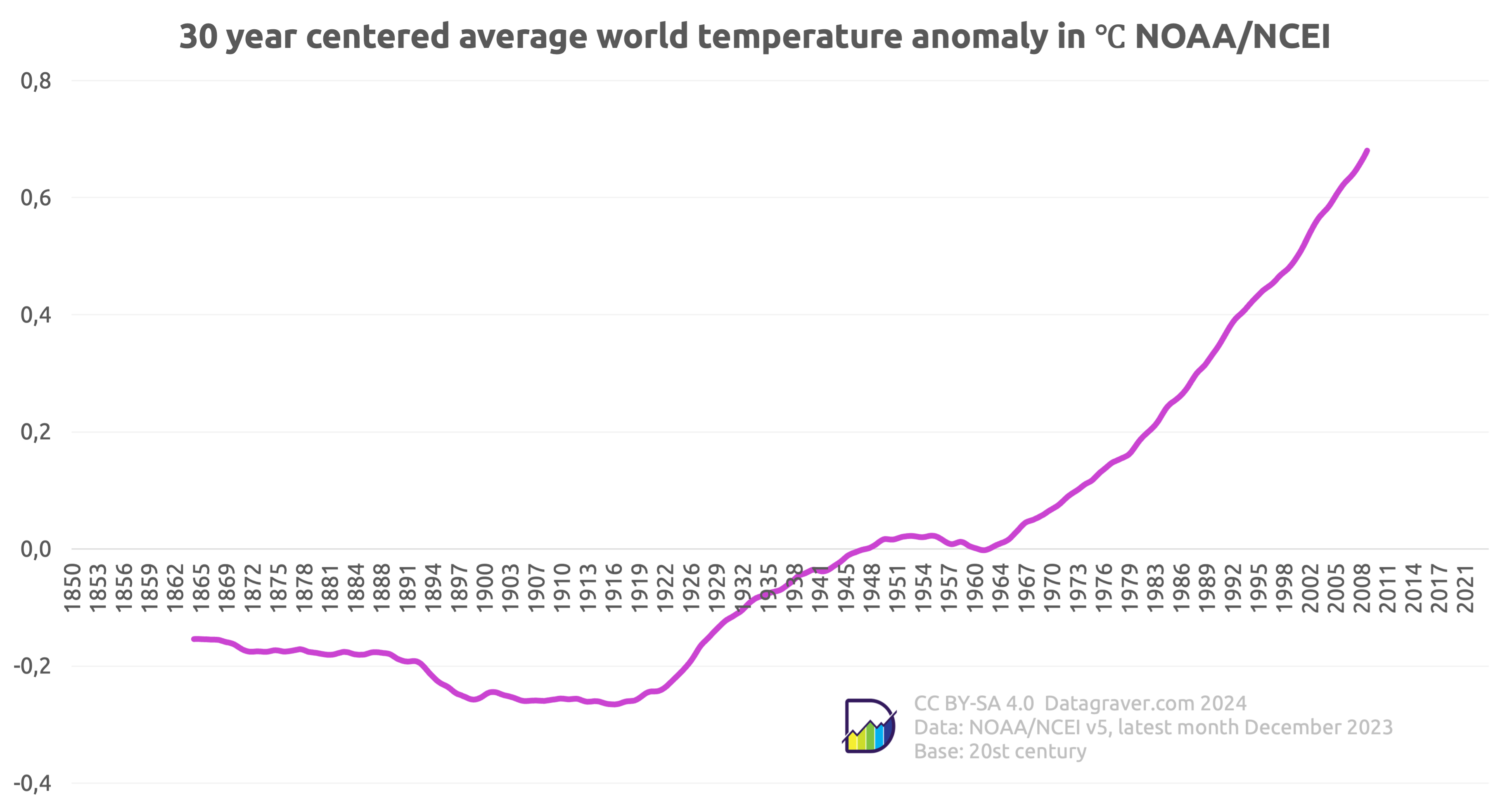
And the centered 30 year average on the monthly anomalies.
![Graph with the centered 30 year average on the monthly world temperature anomalies since 1880 compared to the 20th century. Starting at -0.25 and now at +0.65](https://datagraver.com/wp-content/uploads/2024/01/noaa_30_20240112-1024x547.png)