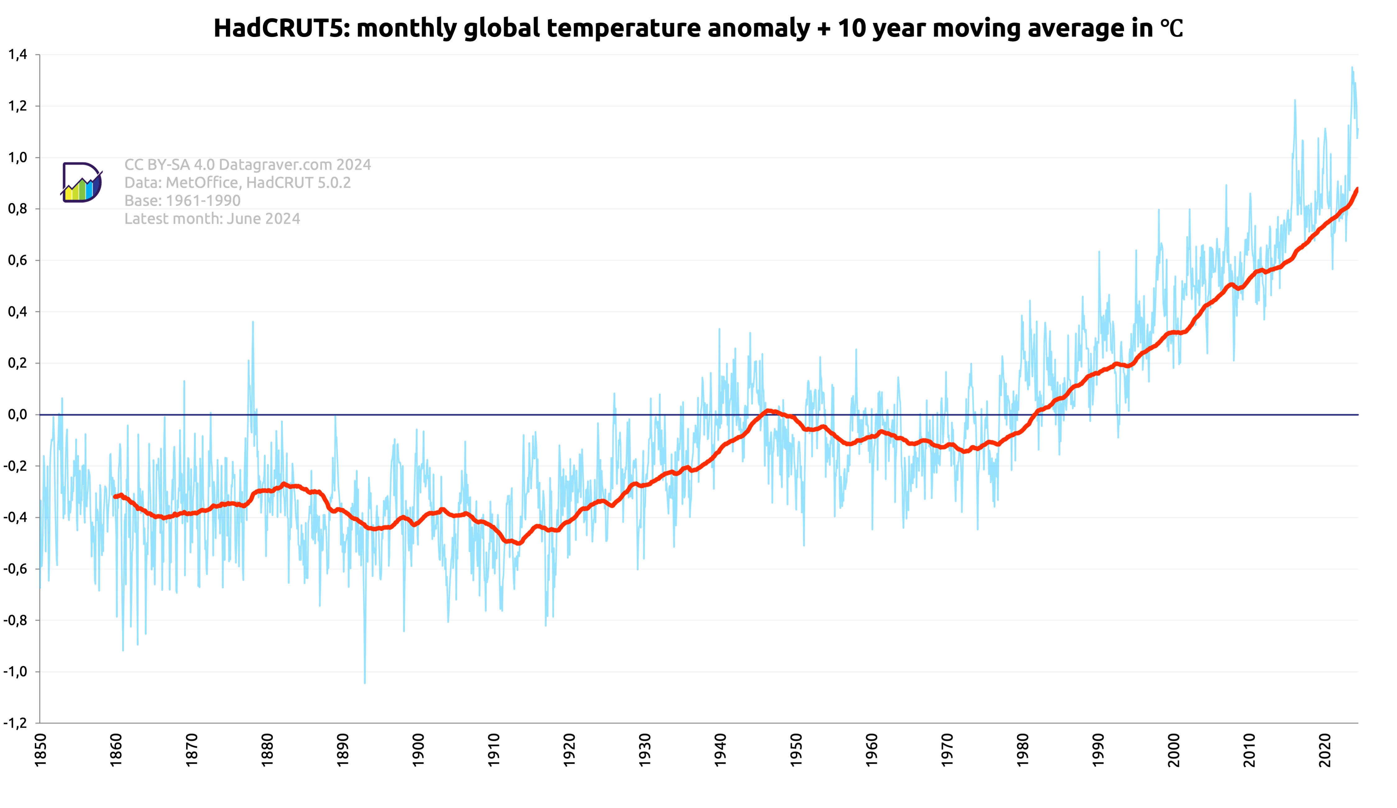
Here graphs based on the HadCRUT 5.0.2 dataset created by the Met Office (UK).
Regular updates. Check date in graph.
First graph is on the monthly anomalies plus a moving 10 year average.
Digging data
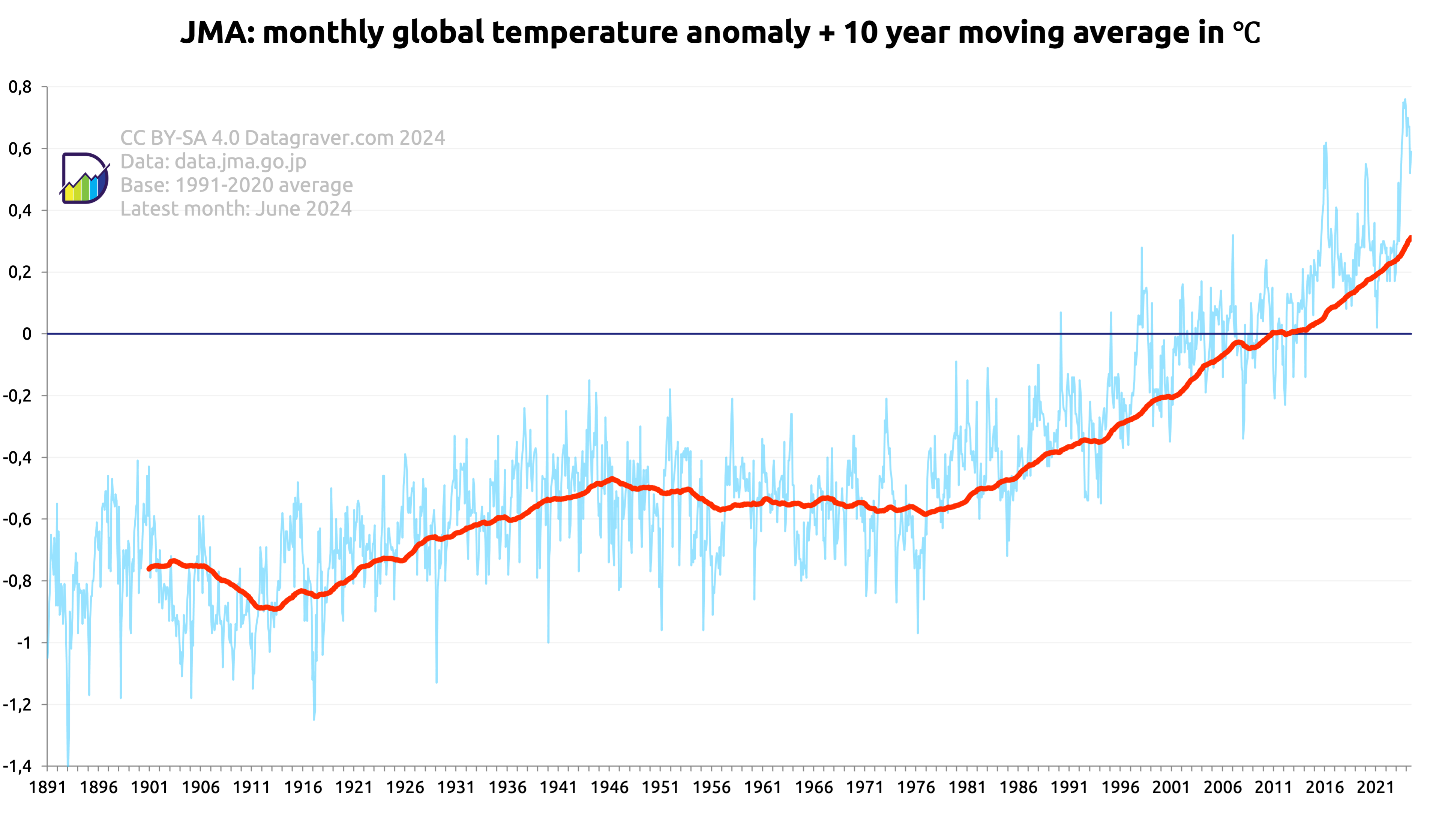
Here graphs based on the HadCRUT 5.0.2 dataset created by the Met Office (UK).
Regular updates. Check date in graph.
First graph is on the monthly anomalies plus a moving 10 year average.
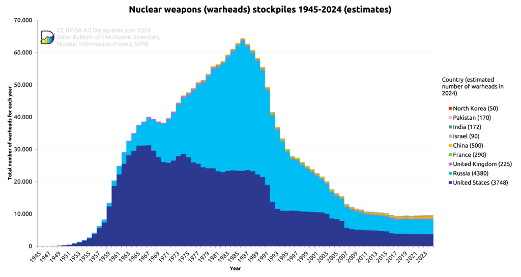
The estimated number of available (usable) nuclear warheads per country since 1945. Data available on data.world.
First as stacked bars to show the totals. Current count is behind country name.
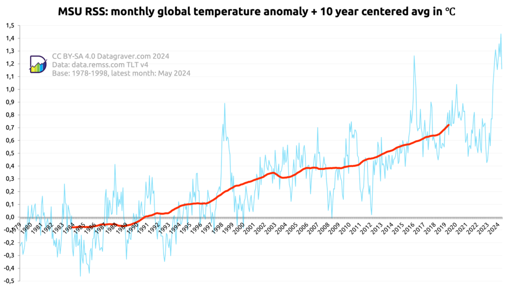
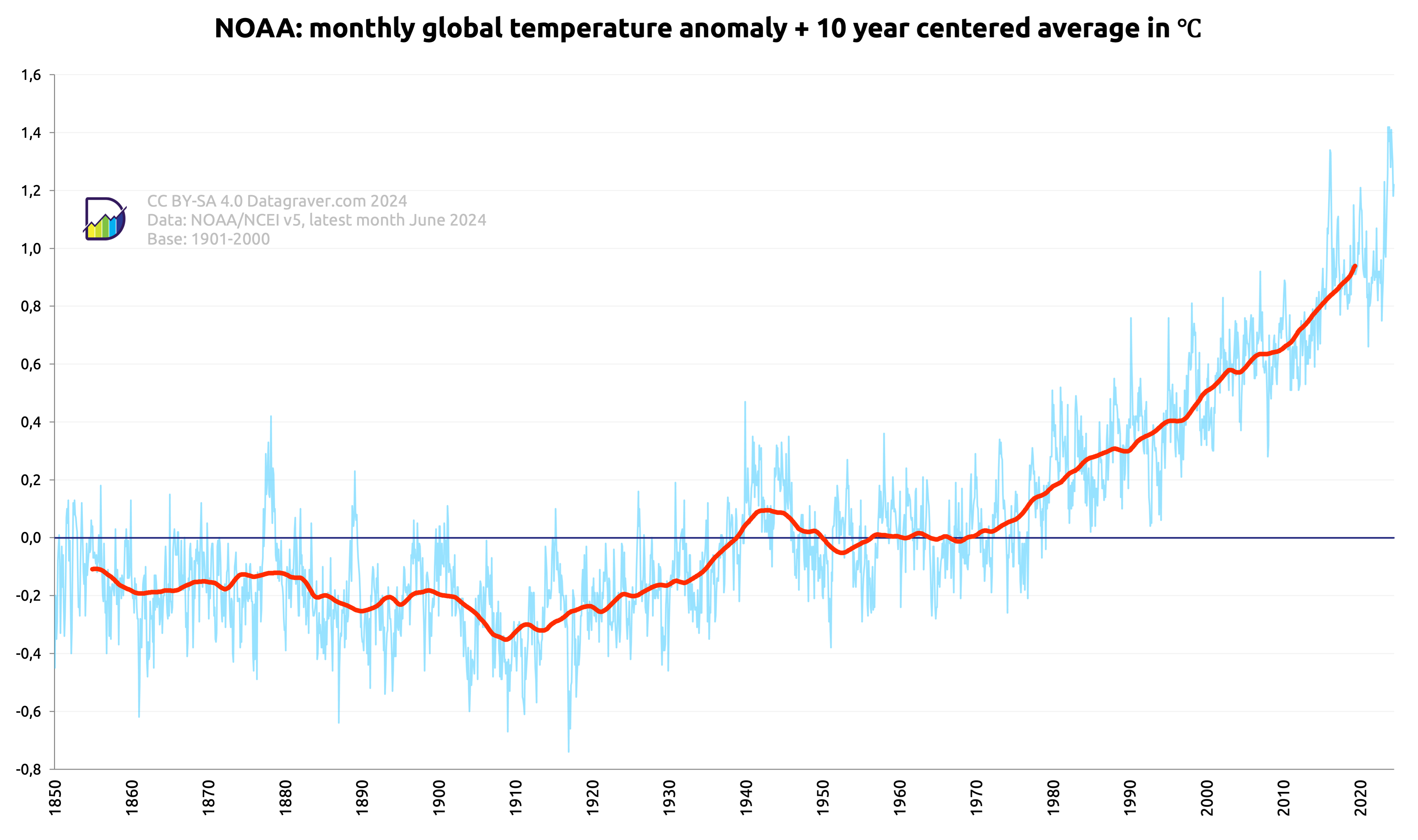
Here graphs based on the V5.1 dataset created by NOAA/NCEI.
Regular updates. Check date in graph.
First graph is on the monthly anomalies plus a centered 10 year average.
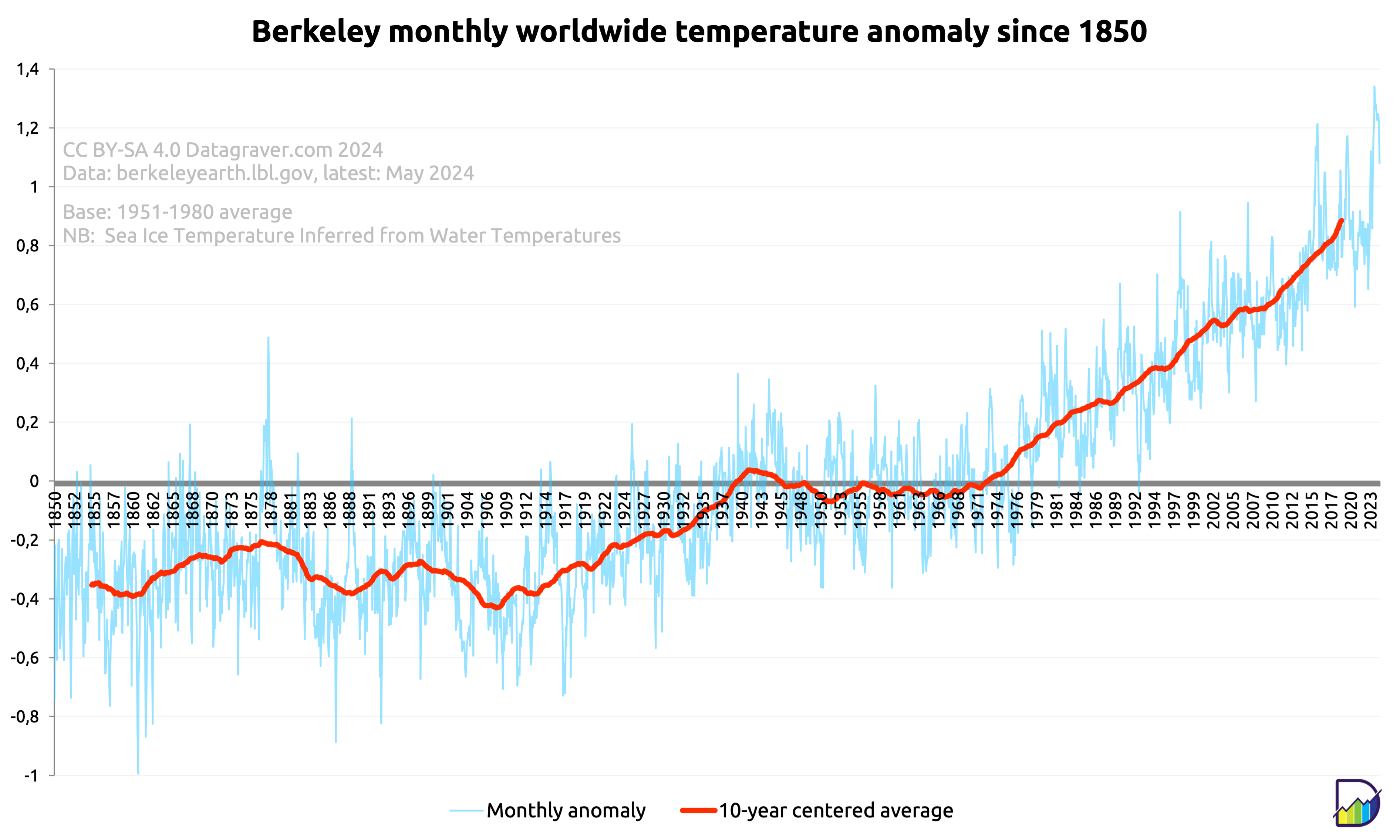
Here graphs based on the Berkeley dataset (reanalysis) created by Berkeley Earth .
Regular updates. Check date in graph.
First graph is on the monthly anomalies plus a centered 10 year average.
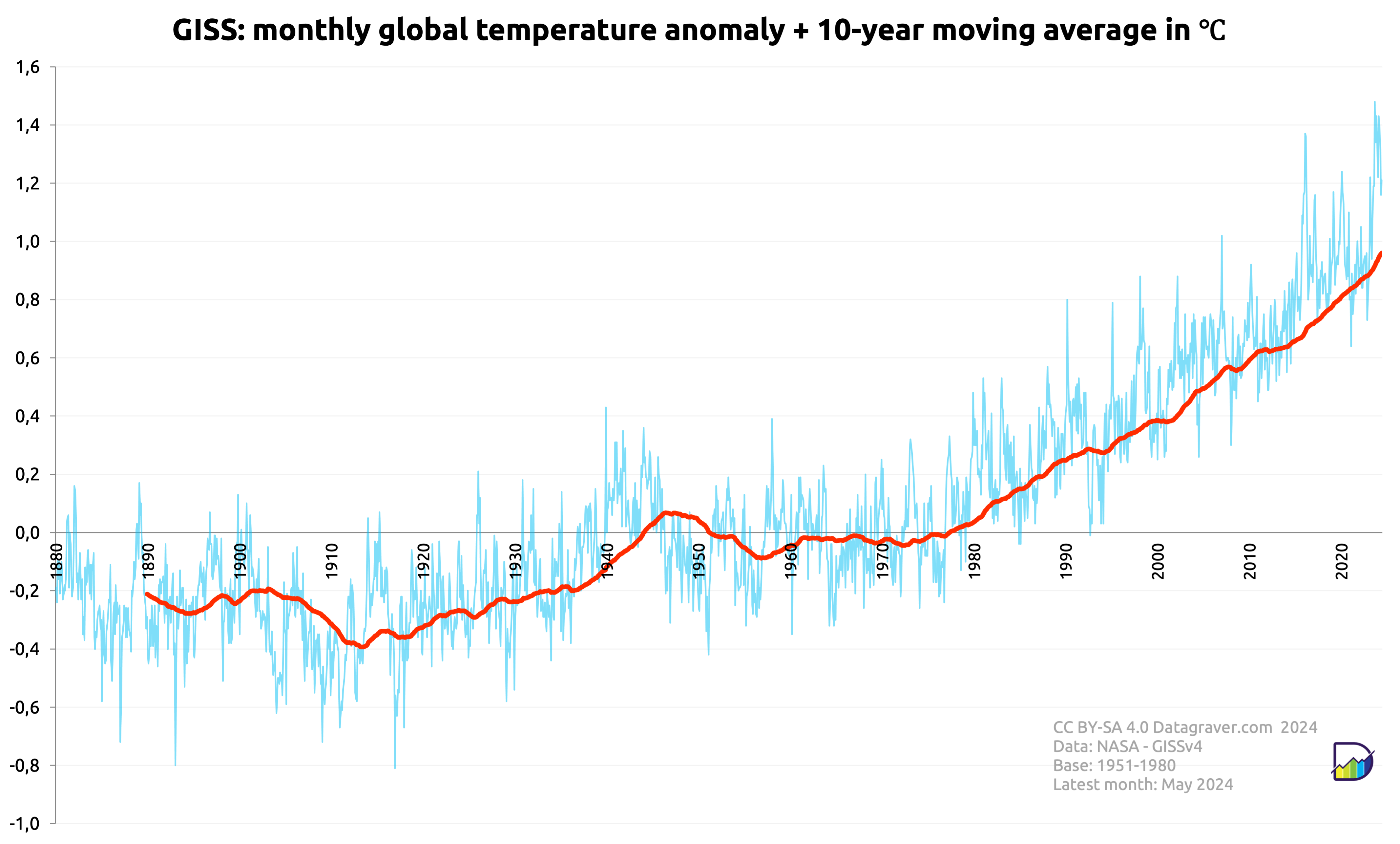
Here graphs based on the GISS dataset created by NASA.
Regular updates. Check date in graph.
First graph is on the monthly anomalies plus a 10 year average.
Then the yearly averages on the monthly anomalies.
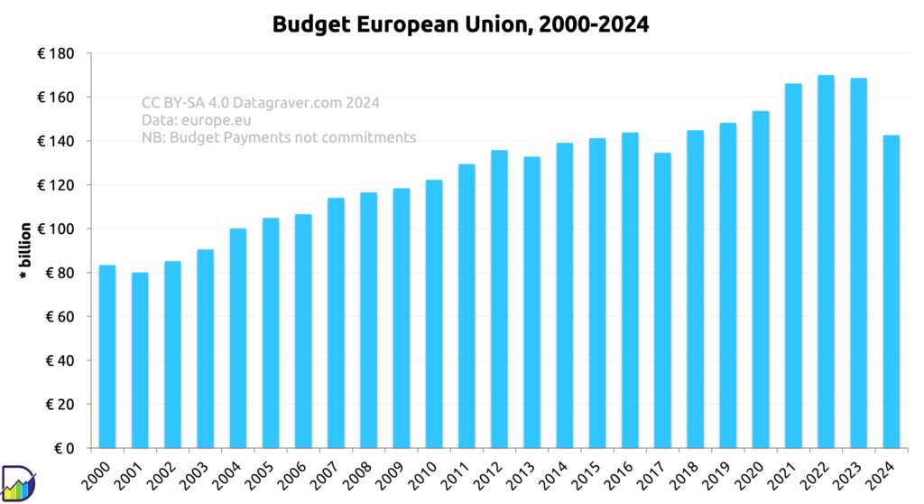
Read moreOverview of the EU budget for each year from 2000 onward. This concerns the Payments part of the budget.
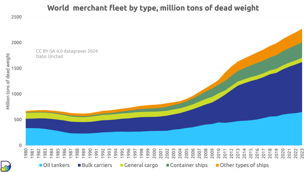
Overview of size of world merchant fleet, in millions of tons dead weight, since 1980. Based on Unctad data.
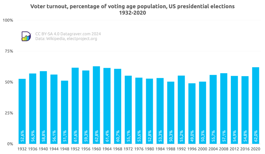
Data on voter turn out and number of votes per candidate in US presidential elections since 1932.
First the voter turnout as percentage of population with voting age.